How to Use
Design a trendy landing page for a Gen-Z fashion line that is full of energy and expression while also having some edge (NOT TOO CLEAN OR PROFESSIONAL). Use a strong design system, such as black backgrounds and white foregrounds with bright accent colours of neon green, hot pink, and electric blue. Use a combination of bold attention-grabbing headline typography for headers and a more casual lower-case typeface for body copy. The layout should have an energetic feel, be slightly asymmetrical, but still visually clear and have the appearance of flowing together.
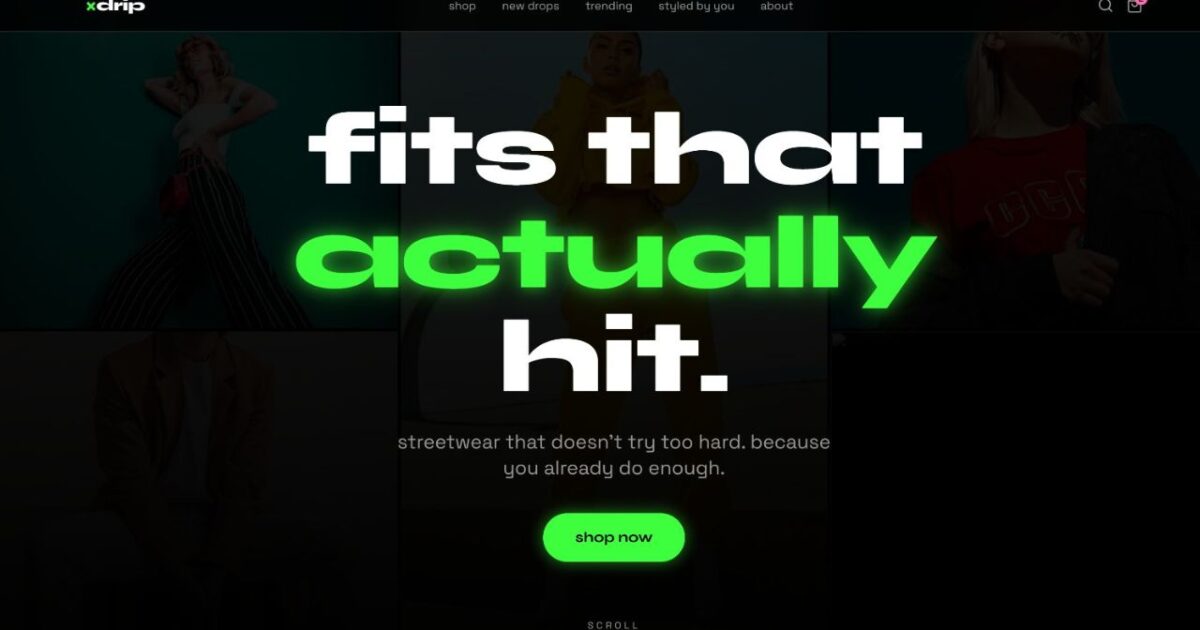
Use a large full-screen “HERO” block/image on the front of the page. This will use a background collage with a collage of street images pulled from curated sites and should look like they were not posed or staged/cleaned up. The Headline should read “FITS THAT ACTUALLY ‘HIT'” in large, bold, oversized text with a neon accent. There will be a very brief, simple subtitle that reads as more of a conversation than a marketing statement below the Headline. Add a round call to action SHOP NOW button that has a soft glow / hover animation when the user hovers over it. There should be a scroll indicator located at the bottom of the page so the user can see where to go next after scrolling down the page.
This will then be followed by a “What’s Trending” section that will be designed as a horizontally scrolling carousel with snap-scrolling for a smooth, mobile-friendly experience. Each card will feature an outfit image, a playful label like “viral rn” or “everyone’s wearing this,” and a “shop fit” button. To make the section feel alive and engaging, consider additional interactive details like a slight rotation or scale effect on hover and neon-accented borders/tags.
Next, a “New Drops” section should be laid out in an asymmetric grid format, displaying two columns on mobile and three on desktop. Each product will show an image with a zoom-on-hover effect; however, give them personality/casual names such as “oversized chaos tee,” pricing, and add small neon pill-shaped tags (e.g., just dropped, limited) to help create urgency while not being too pushy.
The next category will have a full-width brand message area being a interstitial break. The text will be center aligned and have an informal conversational voice with intentional line breaks (i.e. we are not telling you how you should wear it, we only make pieces that represent who you are). The brand message area will also contain a smooth fade in scroll animation to aid in creating an intentional and smooth transition.
The user-generated content portion of the page will feature a styled-by-you section designed in a Pinterest-like masonry layout with a different height for each image’s dimension. The images will represent real/lifestyle type images and should have minimal editing to appear to be authentic, and will be layered with a username on each image and the “Shop this Look” button that appears on hover. The images should have rounded corners and minimal styling to keep the focus on the photo.
The end of the page will have one last cta section stating something to the effect of “Your Next Fit is Waiting” or “Your Next Outfit is just around the corner” with a rounded button that simply states “See Whats New” which will have a hot pink accent and gently pulsing animation to encourage click-through.
Make sure that when you are scrolling through the entire page, the page experience is smooth with gentle animation, such as fade-ins triggered when a new section is visible, and to achieve this by using techniques like Intersection Observer. Create everything assuming a mobile-first user experience and create the opportunity for swipe interactions and fast load times. Use high-quality, relevant placeholder images from Unsplash of streetwear/fashion. Avoid generic ai-style phrases, formal language and a perfect symmetrical layout. Overall experience should feel natural, imperfect and human.